https://www.youtube.com/watch?v=1tz-m88gFVA
js animate 사용으로 좀 더 부드럽게
HTML
|
1
2
3
4
5
6
7
8
9
10
11
12
13
14
15
16
17
18
19
20
21
22
23
24
25
26
27
28
29
|
<!DOCTYPE html>
<html lang="ko">
<head>
<meta charset="UTF-8">
<meta name="viewport" content="width=device-width, initial-scale=1.0">
<title>Document</title>
<link rel="stylesheet" href="https://cdnjs.cloudflare.com/ajax/libs/font-awesome/6.5.1/css/all.min.css" integrity="sha512-DTOQO9RWCH3ppGqcWaEA1BIZOC6xxalwEsw9c2QQeAIftl+Vegovlnee1c9QX4TctnWMn13TZye+giMm8e2LwA==" crossorigin="anonymous" referrerpolicy="no-referrer" />
<link rel="stylesheet" href="./style.css">
<script src="./main.js" defer></script>
</head>
<body>
<!-- https://www.youtube.com/watch?v=1tz-m88gFVA -->
<!-- https://cdnjs.com/libraries/font-awesome -->
<div id="wrapper">
<ul id="list">
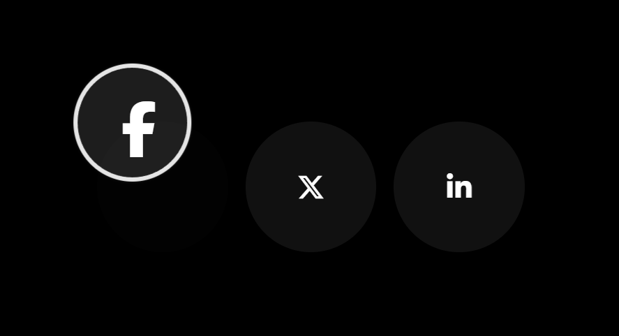
<li class="item">
<i class="fa-brands fa-facebook-f"></i>
</li>
<li class="item">
<i class="fa-brands fa-x-twitter"></i>
</li>
<li class="item">
<i class="fa-brands fa-linkedin-in"></i>
</li>
</ul>
</div>
<div id="cursor"></div>
</body>
</html>
|
cs |
CSS
|
1
2
3
4
5
6
7
8
9
10
11
12
13
14
15
16
17
18
19
20
21
22
23
24
25
26
27
28
29
30
31
32
33
34
35
36
37
38
39
40
41
42
43
44
45
46
47
48
49
50
51
52
53
54
55
56
57
58
59
60
61
62
63
64
65
|
@charset "utf-8";
*{margin:0;padding:0;box-sizing:border-box;}
li{list-style-type:none;}
html,body{
color:#fff;
}
#wrapper{
display:flex; flex-flow:row wrap;
justify-content:center;
align-items: center;
position:relative;
width:100%; height:100vh;
background:#000;
}
#list{
display:flex; flex-flow:row wrap;
justify-content:center;
align-items:center;
gap:20px;
position:relative;
}
.item{
position:relative;
/* overflow:hidden; */
width:150px; aspect-ratio:1/1;
background:#111;
border-radius:50%;
transition:background .3s;
cursor:pointer;
}
.item:hover{
background:transparent;
}
.item i{
position:absolute;
top:50%;left:50%;
transform:translate(-50%,-50%);
font-size:2rem;
pointer-events:none; user-select:none; cursor:none;
}
#cursor{
position:fixed;
top:0;left:0;
width:20px; aspect-ratio:1/1;
background:rgba(255,255,255,1);
border-radius:50%;
box-shadow:
0 0 30px rgba(255,255,255,1),
0 0 10px rgba(255,255,255,1),
0 0 20px rgba(255,255,255,.5);
border:5px solid transparent;
transition:all .3s, transform 0s;
}
#cursor.on{
background:rgba(255,255,255,0);
border-color:#fff;
box-shadow:none;
width:150px;
pointer-events:none;
}
|
cs |
JS
|
1
2
3
4
5
6
7
8
9
10
11
12
13
14
15
16
17
18
19
20
21
22
23
24
25
26
27
28
29
30
31
32
33
34
35
36
37
38
39
40
41
42
43
44
45
46
47
48
49
50
51
52
53
54
55
56
57
58
|
const $cursor = document.getElementById("cursor");
const $$item = document.getElementsByClassName("item");
window.addEventListener("mousemove",(e)=>{
const {clientX,clientY} = e;
const {width} = $cursor.getBoundingClientRect();
$cursor.animate([
{
transform : `translate(${clientX - width/2}px, ${clientY - width/2}px)`
}
],{
duration : 500,
fill : "forwards"
});
});
for(let i = 0; i < $$item.length; i ++){
const $item = $$item[i];
const $i = $item.querySelector("I");
const {left,top} = $item.getBoundingClientRect();
const {width,height} = $i.getBoundingClientRect();
$item.addEventListener("mouseenter",(e)=>{
$cursor.classList.add("on")
});
$item.addEventListener("mousemove",(e)=>{
const {clientX,clientY} = e;
const x = (clientX - left) - (width);
const y = (clientY - top) - (height);
$i.animate([
{
top : "0",
left : "0",
transform : `translate(${x}px, ${y}px)`,
fontSize : "4rem"
}
],{
duration : 500,
fill : "forwards",
delay : 200,
});
});
$item.addEventListener("mouseleave",(e)=>{
$cursor.classList.remove("on")
$i.animate([
{
top : "50%",
left : "50%",
transform : `translate(-50%, -50%)`,
fontSize : "2rem"
}
],{
duration : 500,
fill : "forwards",
delay : 250,
});
});
}//for
|
cs |
'CSS&JS > 👀Study and Copy' 카테고리의 다른 글
| [CSS/JS]Lun Dev 쇼핑몰 이미지 줌 효과 (1) | 2024.09.13 |
|---|---|
| [JS]팝업창에 함수를 전달하고, 팝업창의 변수를 부모창에 전달하는 방법. (0) | 2024.04.16 |
| [ZeroCho]인간 JS엔진 되기 1-6 this는 호출 때 결정된다. (1) | 2024.01.04 |
| [별코딩]Promise.all .allSettled .any .race 예제로 비교하기 (0) | 2024.01.03 |
| [Hyperplexed] 카운터 애니메이션 (1) | 2023.12.12 |