원본 : https://codepen.io/Hyperplexed/pen/MWQeYLW
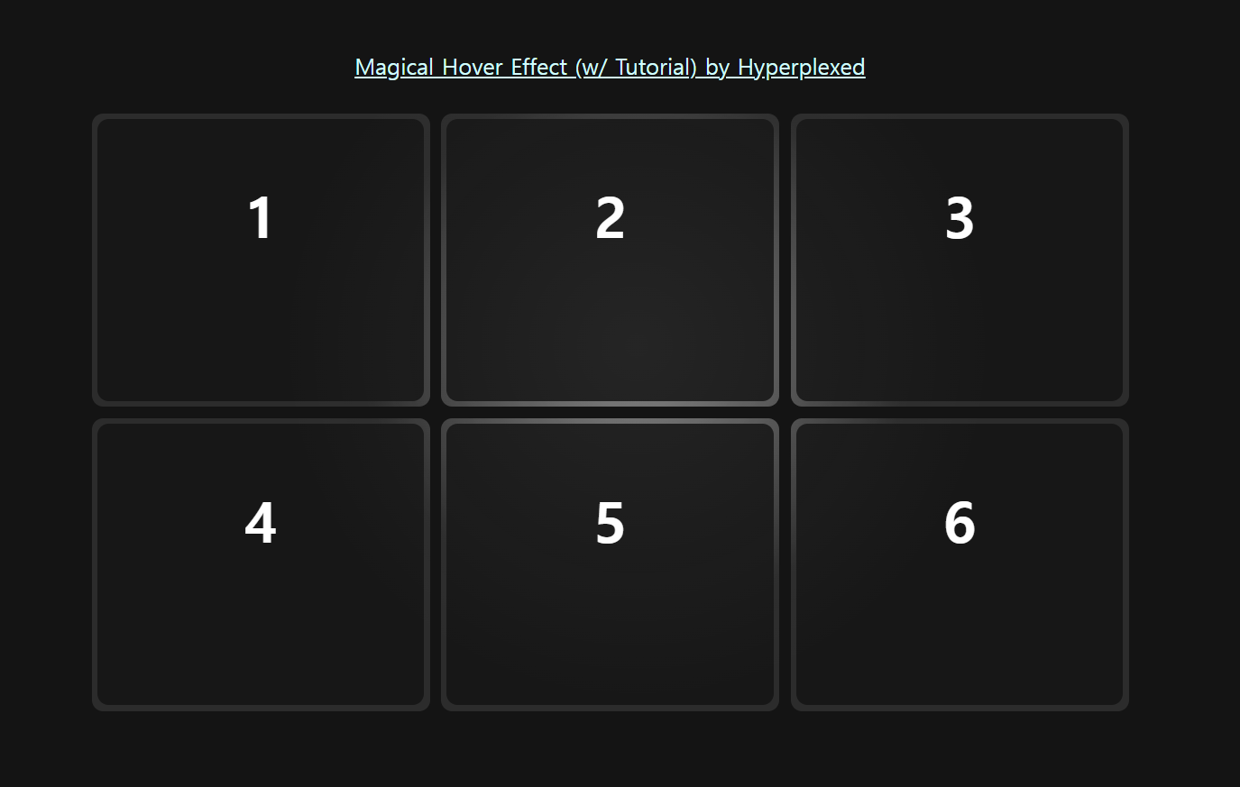
Magical Hover Effect (w/ Tutorial)
A recreation of the amazing hover effect found here: https://linear.app/features ...
codepen.io
이런거 보면 진짜 정말 대단하고 기발한 사람들이 많다...👍
- 마우스의 clientX, clientY 값에 따라서 background의 radial-gradient 값의 시작 좌표 값을 바꿔준다 (style.setProperty 사용)
- 테두리도 반짝이는것처럼 보이는 효과는 실제로 border를 준게 아니라, 좀 더 작은 DOM을 자식요소로 넣은것이다 (inset의 값이 커질수록 테두리는 굵어보인다.)
HTML
|
1
2
3
4
5
6
7
8
9
10
11
12
13
14
15
16
17
18
19
20
21
22
23
24
25
26
27
28
29
30
31
32
33
34
35
|
<!DOCTYPE html>
<html lang="en">
<head>
<meta charset="UTF-8">
<meta http-equiv="X-UA-Compatible" content="IE=edge">
<meta name="viewport" content="width=device-width, initial-scale=1.0">
<title>3d hover card light</title>
<link rel="stylesheet" href="./style.css">
<script src="./main.js" defer></script>
</head>
<body>
<a href="https://codepen.io/Hyperplexed/pen/MWQeYLW">Magical Hover Effect (w/ Tutorial) by Hyperplexed</a>
<section id="wrap-card">
<div class="card">
<div class="card-content">1</div>
</div>
<div class="card">
<div class="card-content">2</div>
</div>
<div class="card">
<div class="card-content">3</div>
</div>
<div class="card">
<div class="card-content">4</div>
</div>
<div class="card">
<div class="card-content">5</div>
</div>
<div class="card">
<div class="card-content">6</div>
</div>
</section><!-- wrap-card -->
</body>
</html>
|
cs |
CSS
|
1
2
3
4
5
6
7
8
9
10
11
12
13
14
15
16
17
18
19
20
21
22
23
24
25
26
27
28
29
30
31
32
33
34
35
36
37
38
39
40
41
42
43
44
45
46
47
48
49
50
51
52
53
54
55
56
57
58
59
60
61
62
63
64
65
66
67
68
69
70
71
72
73
74
75
|
@charset "utf-8";
:root{
--bg:rgb(20,20,20);
--card-bg:rgba(255,255,255,.1);
--card:rgb(23,23,23);
--rad:10px;
}
a{color:rgb(210, 255, 255); font-size:20px;}
body{
display:flex;flex-flow:column nowrap;
justify-content:center; align-items:center;
gap:30px;
min-height:100vh;
background:var(--bg);
color:#fff;
}
#wrap-card{
display:flex;flex-flow:row wrap;
justify-content:center; align-items:center;
gap:10px;
position:relative;
width:100%; max-width:1200px;
}
/* */
.card{
position:relative;
width:300px; height:260px;
background:var(--card-bg);
border-radius:var(--rad);
}
/* 후레쉬라이트~~ */
.card::before,
.card::after{
content:''; display:block; position:absolute;
/* opacity:0; */
top:0;left:0;
width:100%; height:100%;
border-radius:inherit;
transition:opacity .5s;
pointer-events:none;
}
.card:hover::before,
.card:hover::after{
opacity:1;
}
.card::before{
background: radial-gradient(
600px circle at var(--x) var(--y),
rgba(255, 255, 255, .4),
transparent 40%
);
}
.card::after{
background:radial-gradient(
800px circle at var(--x) var(--y),
rgba(255,255,255,.06),
transparent 40%
);
}
/* */
.card-content{
position:absolute;
inset:5px;
padding:1em;
background:var(--card);
border-radius:var(--rad);
font-size:5vmin; text-align:center; font-weight:bold;
}
|
cs |
JS
|
1
2
3
4
5
6
7
8
9
10
|
document.getElementById("cards").onmousemove = e => {
for(const card of document.getElementsByClassName("card")) {
const rect = card.getBoundingClientRect(),
x = e.clientX - rect.left,
y = e.clientY - rect.top;
card.style.setProperty("--mouse-x", `${x}px`);
card.style.setProperty("--mouse-y", `${y}px`);
};
}
|
cs |
'CSS&JS > 👀Study and Copy' 카테고리의 다른 글
| [CSS+JS]3분할 슬라이드(2) (0) | 2023.01.20 |
|---|---|
| [CSS+JS] 3분할 슬라이드(1) - 초단순 버젼 (0) | 2023.01.18 |
| [CSS] 아쿠아 버튼(copy) (0) | 2023.01.10 |
| [CSS] Gooey effect 끈적거리며 달라붙는 효과 (SVG:filter) (0) | 2023.01.10 |
| [JS]페이지 갱신 없이 주소 바꾸기(history.pushState(), history.replaceState() (0) | 2023.01.04 |